BACK TO DESIGN
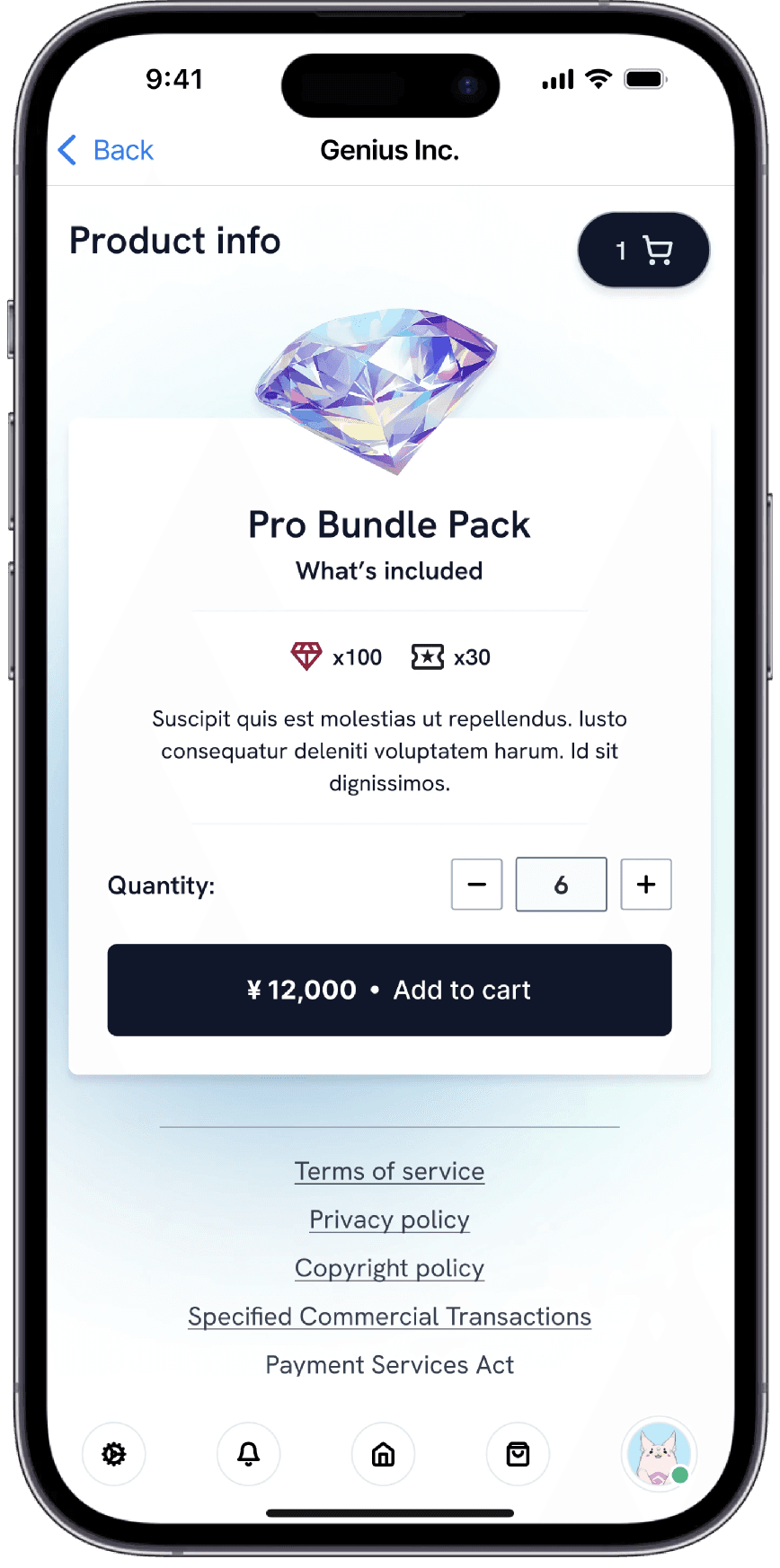
The Genius Webstore app lets players easily access discounted in-game items for a more affordable experience.
Elizabeth Omoniyi
1 Sept 2024
My role
Lead UX Designer
User research
Ideation and wireframing
Usability study
Prototyping
Design critique session
Project Overview
The Genius web store project was developed to create a seamless platform for discounted in-game purchases. The goal was to make in-game items more accessible and affordable, enhancing the overall user experience. The project included analyzing eCommerce flows to design a user-friendly app for gamers.
The Challenge
Games often have premium content that can be costly and complex to purchase, creating a barrier for players who want to enhance their experience affordably. This can lead to frustration and decreased engagement, as players feel limited in accessing desired items.
The Goal
The goal was to simplify the in-game purchase process, making it easy for players to access and buy items quickly and seamlessly, enhancing the overall user experience and satisfaction.
Understanding the user
I began gathering requirements on the user by doing quantitative and qualitative research. This involved surveys and interviews to gain insight into user needs and pain points. The results of the research allowed me to create personas and empathy maps of users. Based on the research feedback, I discovered that users found the current store unclear and, as there was no option for bulk checkout, the process felt lengthy and frustrating.


The research confirmed that users were frustrated with the lengthy checkout process for multiple items and the unclear flow of the current web app. This highlighted a need for a more streamlined and intuitive purchase experience. I adjusted the design to simplify the checkout process, improve clarity, and ensure accessibility, creating a faster and more seamless flow for all users.
Prototype
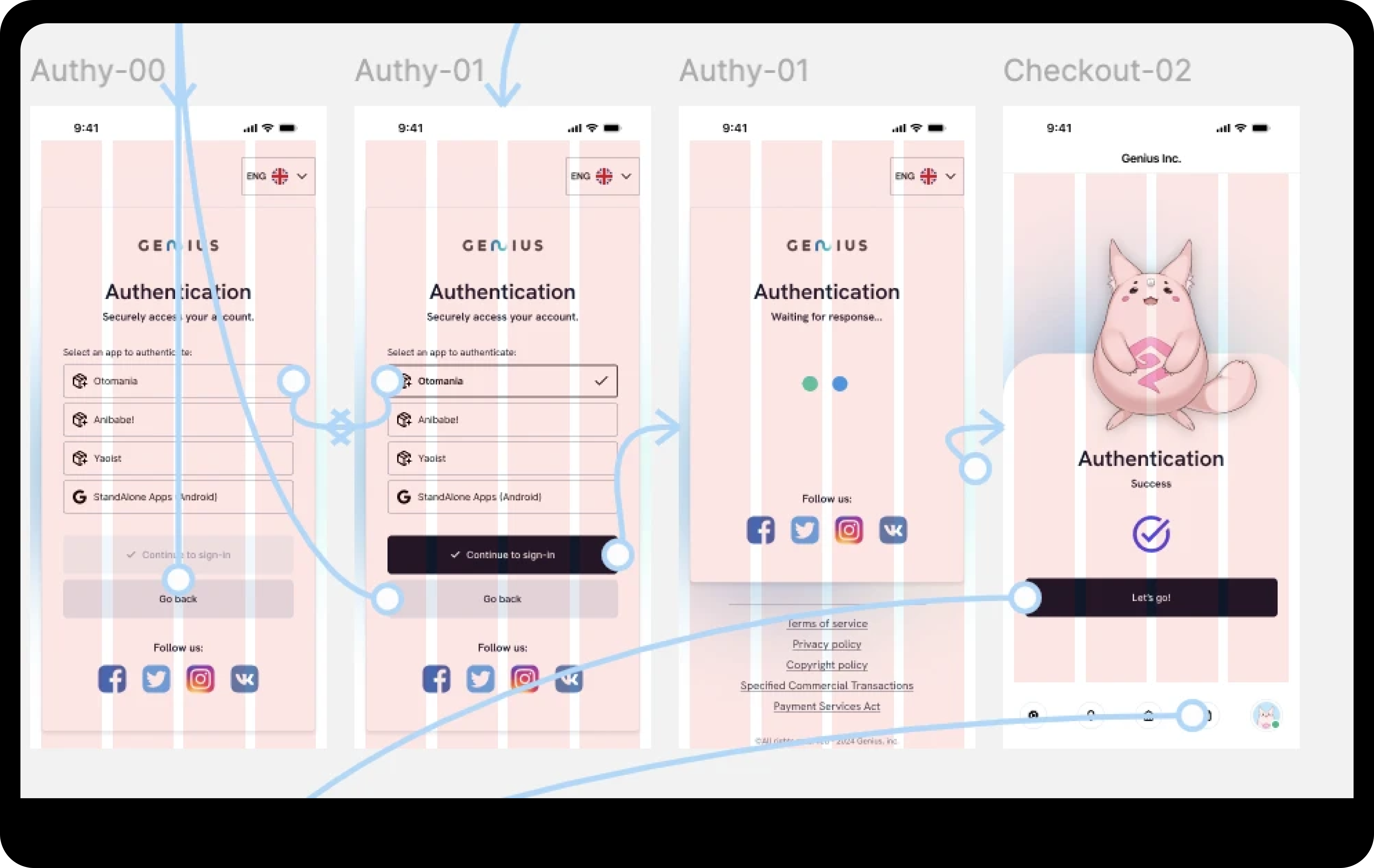
A standard user flow that allows users to authenticate, browse gems, add them to their cart, complete the purchase process, and track their orders within the app.
Usability study
I conducted a usability study to assess whether the main user experience, purchasing in-game items, was intuitive and easy for users to complete. I wanted to identify specific challenges users might face during the purchasing process. The key results showed:
70% of users want the option to bulk order
85% of users prefer a clear "Add to Cart" button
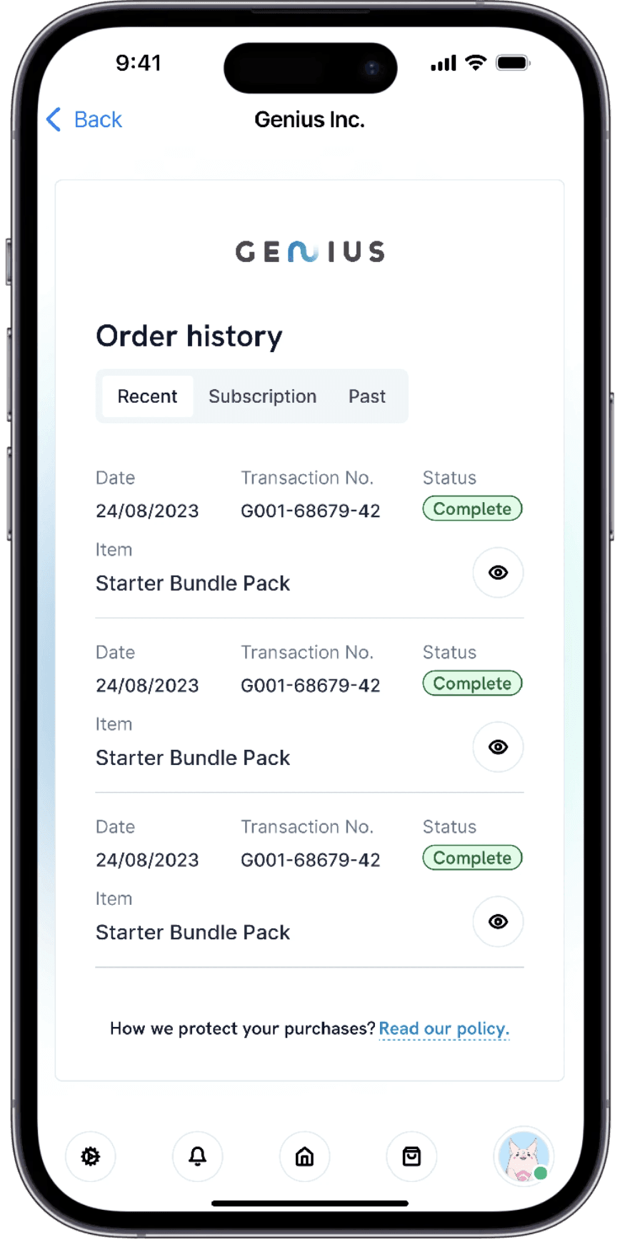
60% of users want an easy way to check past orders
These insights helped guide design improvements to make the purchasing process more user-friendly and efficient.
Design Iteration
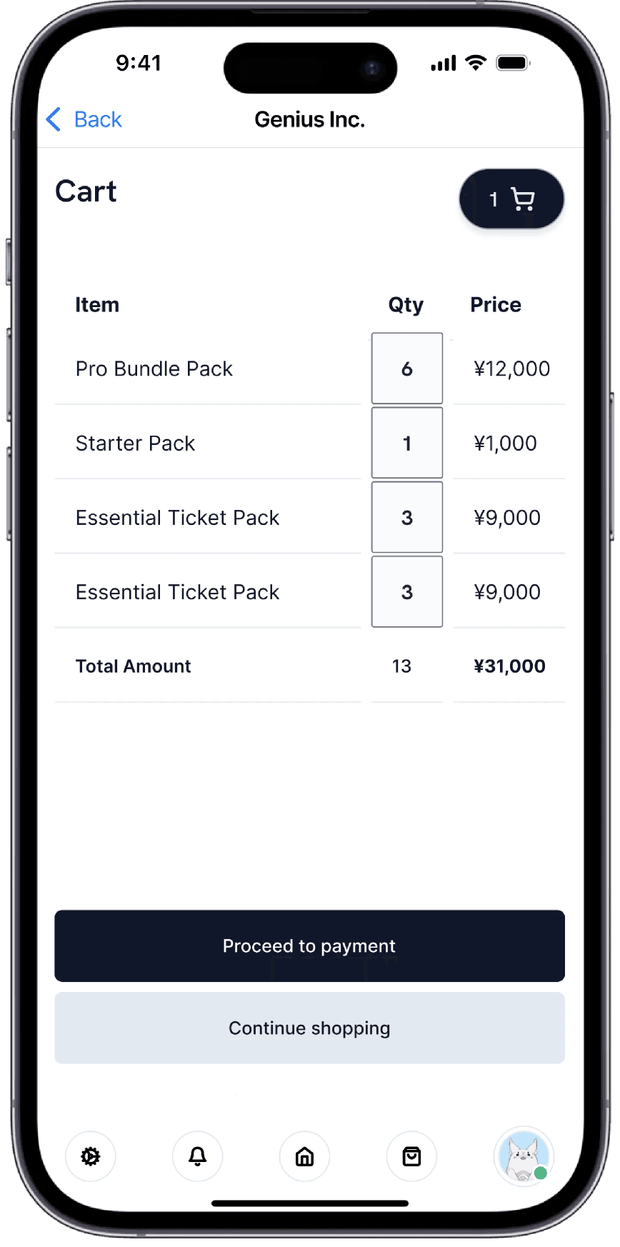
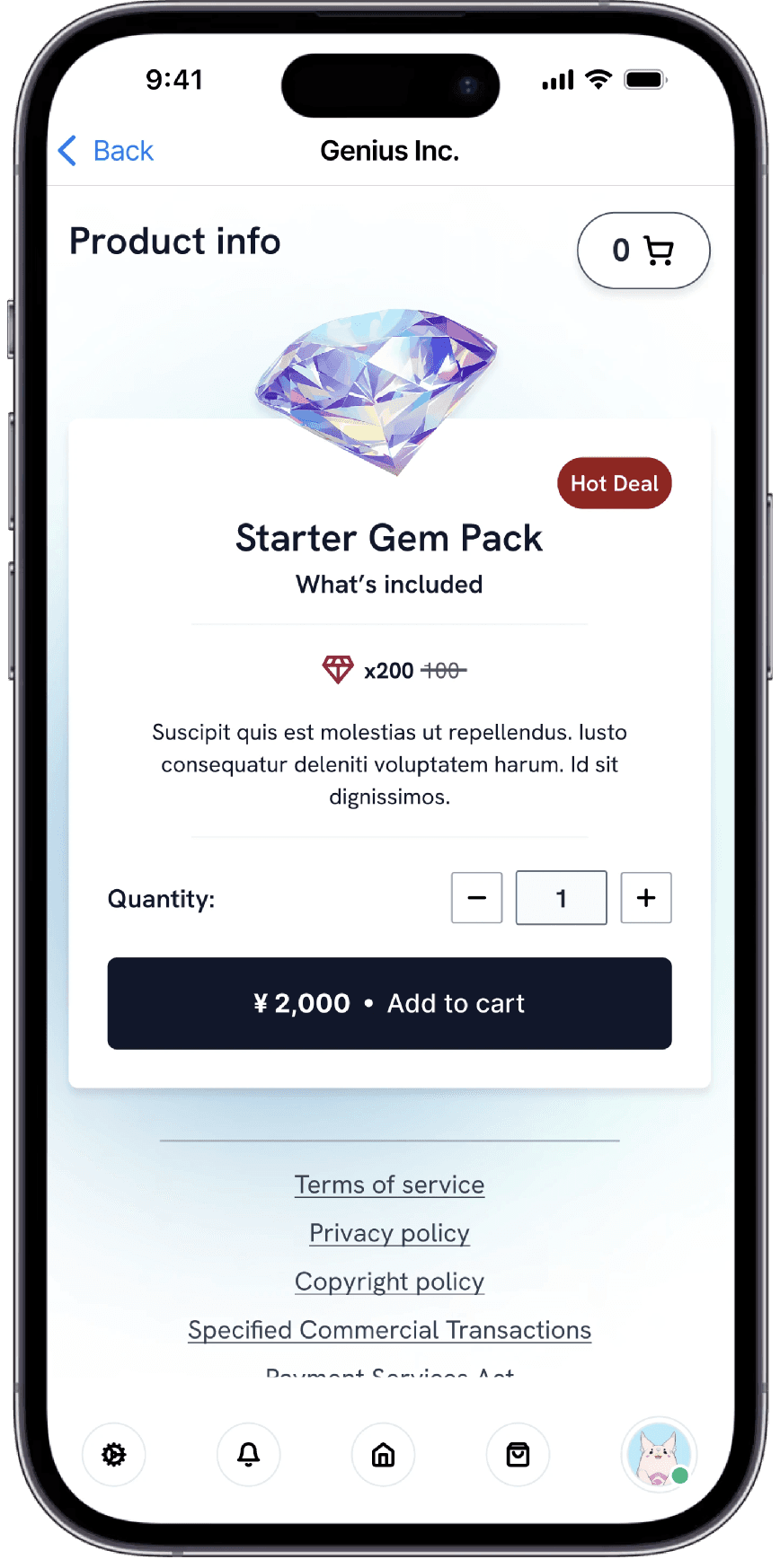
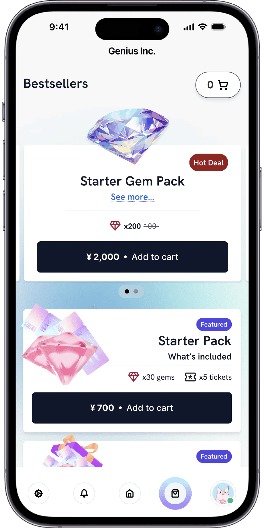
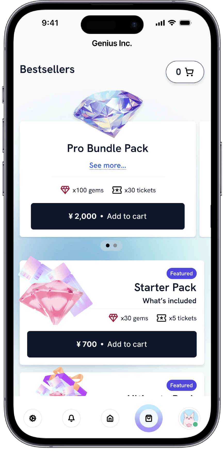
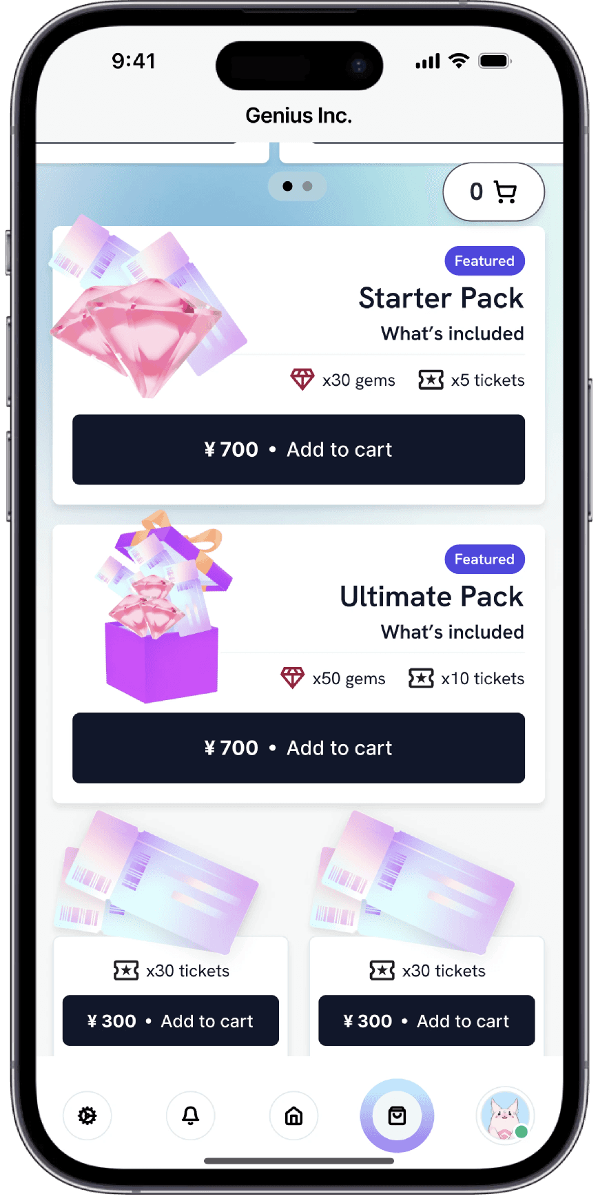
Users wanted the ability to bulk order, and a clear "Add to Cart" button.
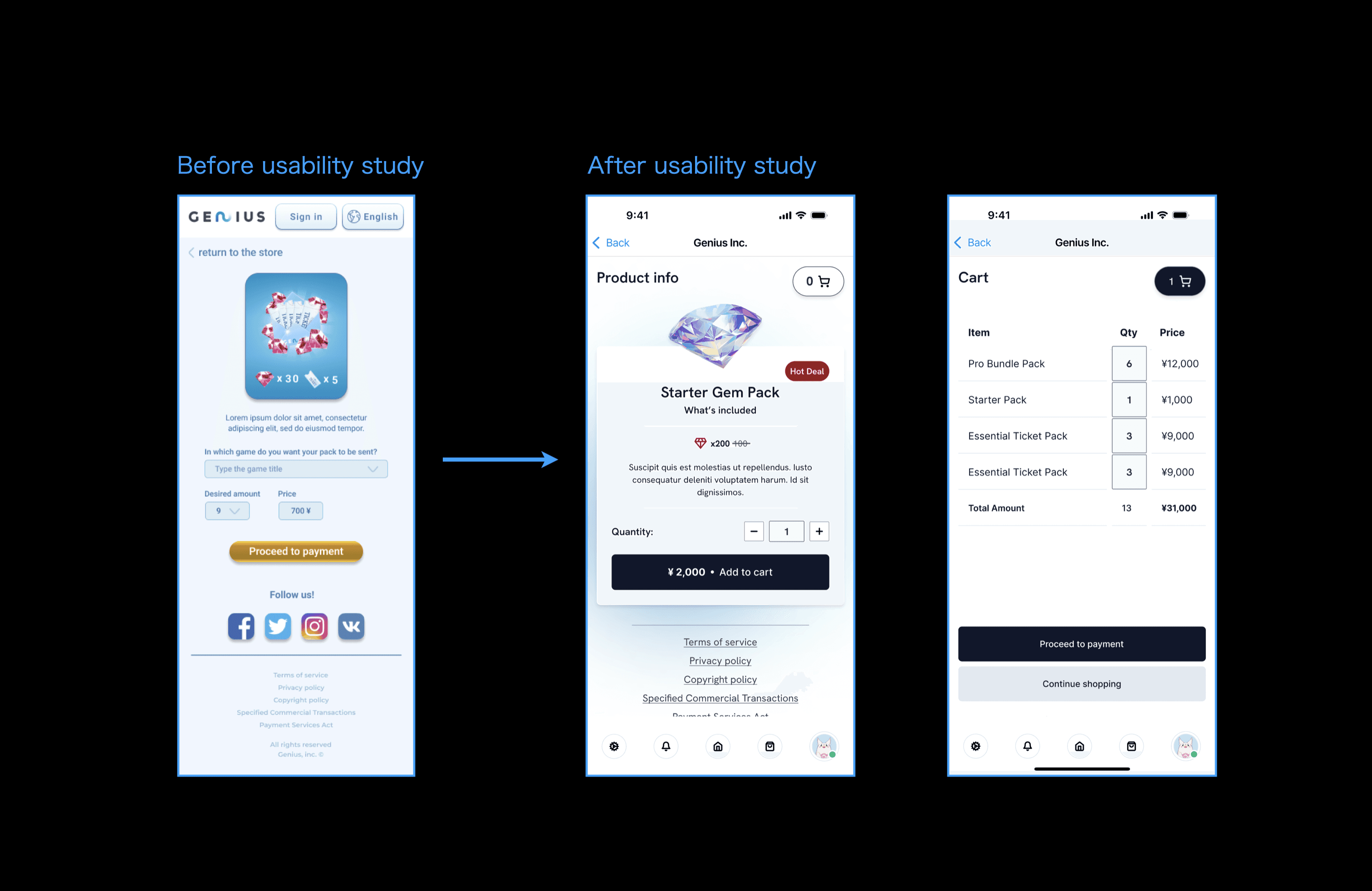
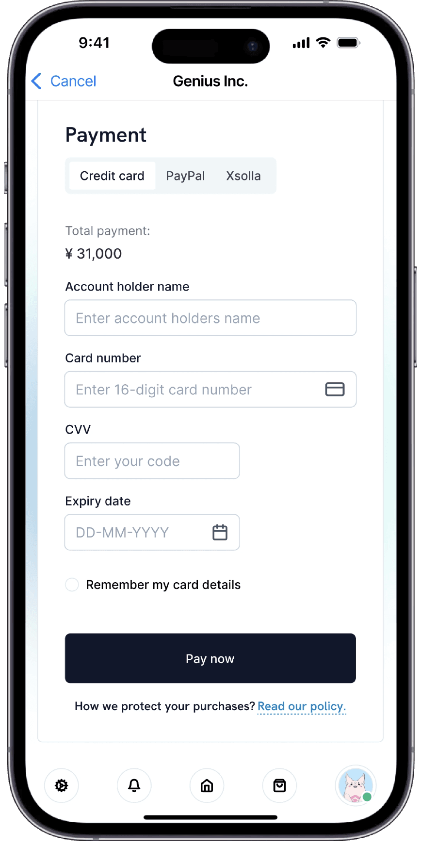
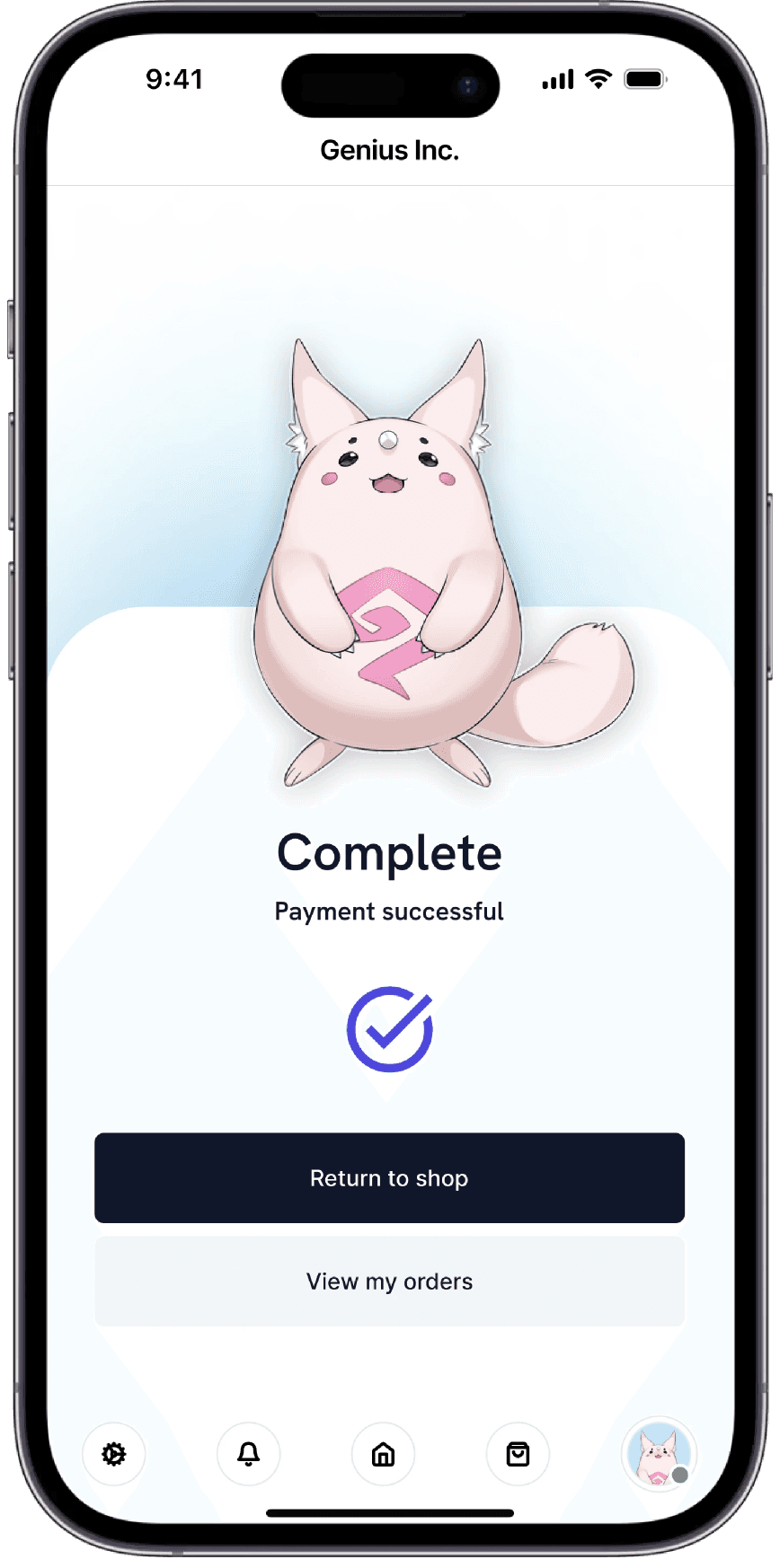
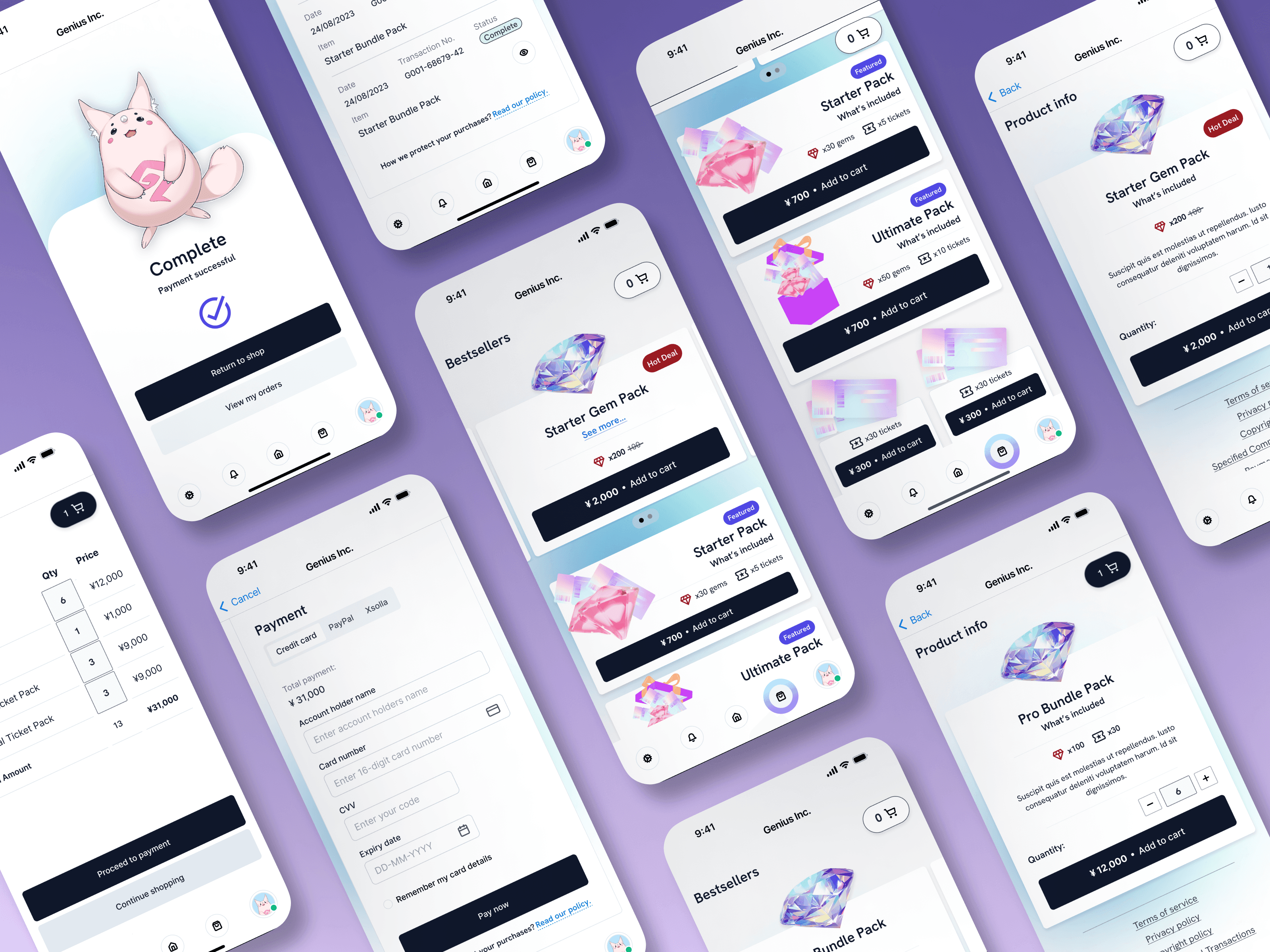
There was no "Add to Cart" feature, and action buttons were missing, making the user experience unclear and difficult. I addressed this by adding the necessary "Add to Cart" buttons and improving the placement of action buttons for easier navigation. I also made the text and color scheme more accessible, increasing button sizes and ensuring better contrast for improved visibility. Additionally, I improved the payment confirmation process and introduced a 3D graphic to make the experience more fun and engaging, adding a dynamic visual cue when users complete their purchase.
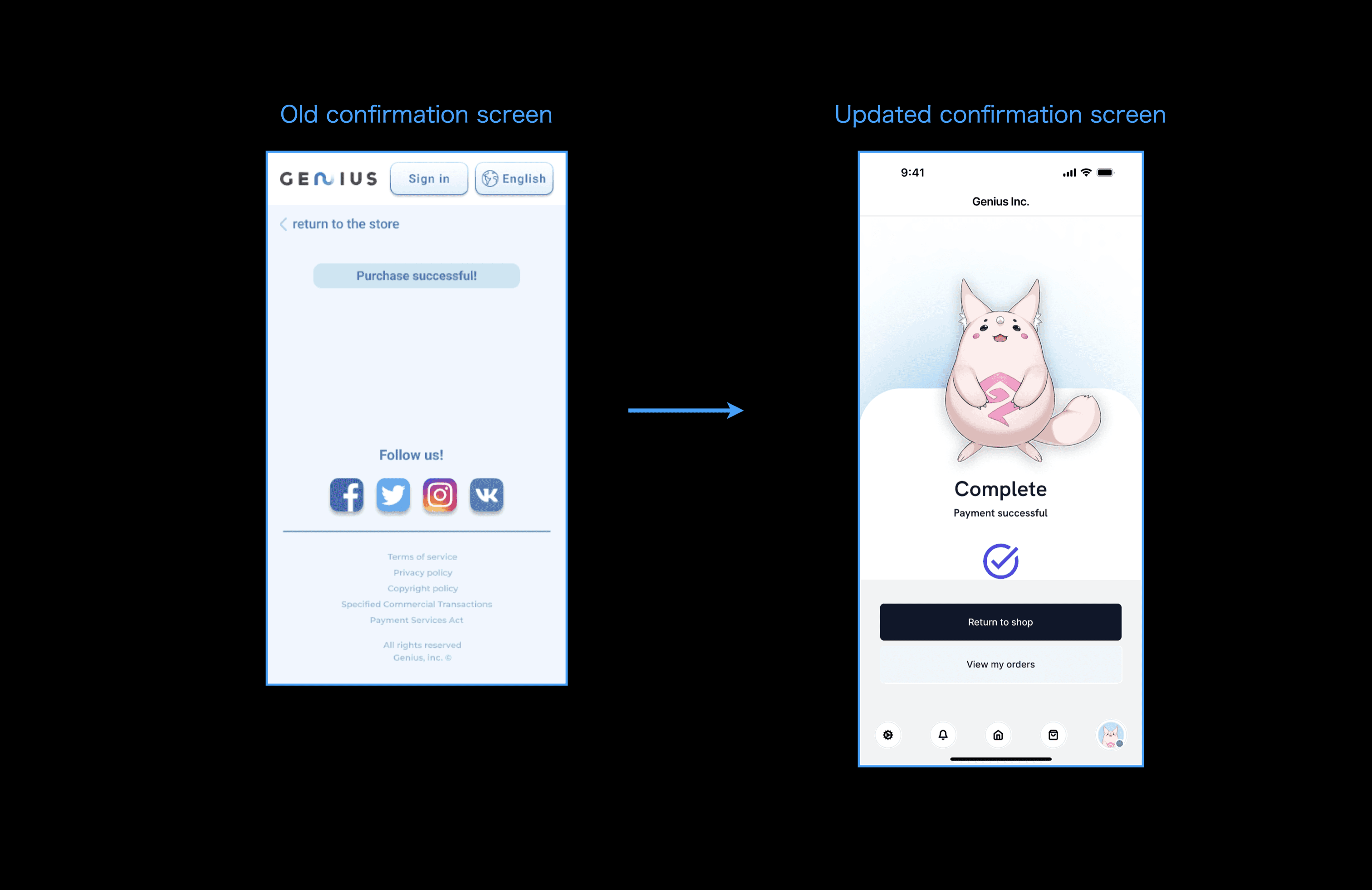
High-fidelity prototype available on request.
Mock-ups
Results!
The designs for my web app have garnered positive responses. During the focus group review of the final mockup, participants highlighted the following points:
"Finding my gems and tickets is so easy."
"I love how simple it is!"
"Everything is super easy to use. It saves me so much time!"
"I can get my gems quickly now. It's great!
What did I learn?
This project taught me a lot about designing an e-commerce app that’s both enjoyable and easy to navigate. I focused on accessibility, which pushed me to simplify the design and make everything intuitive and familiar for users. It was exciting to see how these choices improved clarity and made the app more functional.
