BACK TO DESIGN
Cinesnack is an app that lets users quickly and easily pre-order snacks at the cinema or from their seat


Elizabeth Omoniyi
22 Jul 2024
My role
Lead UX Designer
User research
Ideation and wireframing
Usability study
Prototyping
Design critique session
Project Overview
The Cinesnack project was developed through the Google UX Course. Its goal was to streamline the snack ordering process to reduce wait times and minimize discomfort, enhancing the overall cinema experience. The project involved reviewing and refining existing cinema apps to imagine and develop concepts that could be proposed to clients.
The Challenge
Cinemas tend to have long wait times and crowds depending on the film release schedule, large crowds create noisy environments make ordering frustrating and time-consuming. This leads to rushed film screenings and customer dissatisfaction.
The Goal
Streamline the snack ordering process to reduce wait times and minimize discomfort, enhancing the overall cinema experience for customers.
Understanding the user
I began gathering requirements on the user by doing quantitive and qualitative research. This involved surveys and interviews to gain insight into user needs and pain points. The results of research allowed me to create personas and empathy maps of users. Based on the research feedback I discovered that users were frustrated by waiting in lines and would prefer to order snacks from their seats or before arriving.
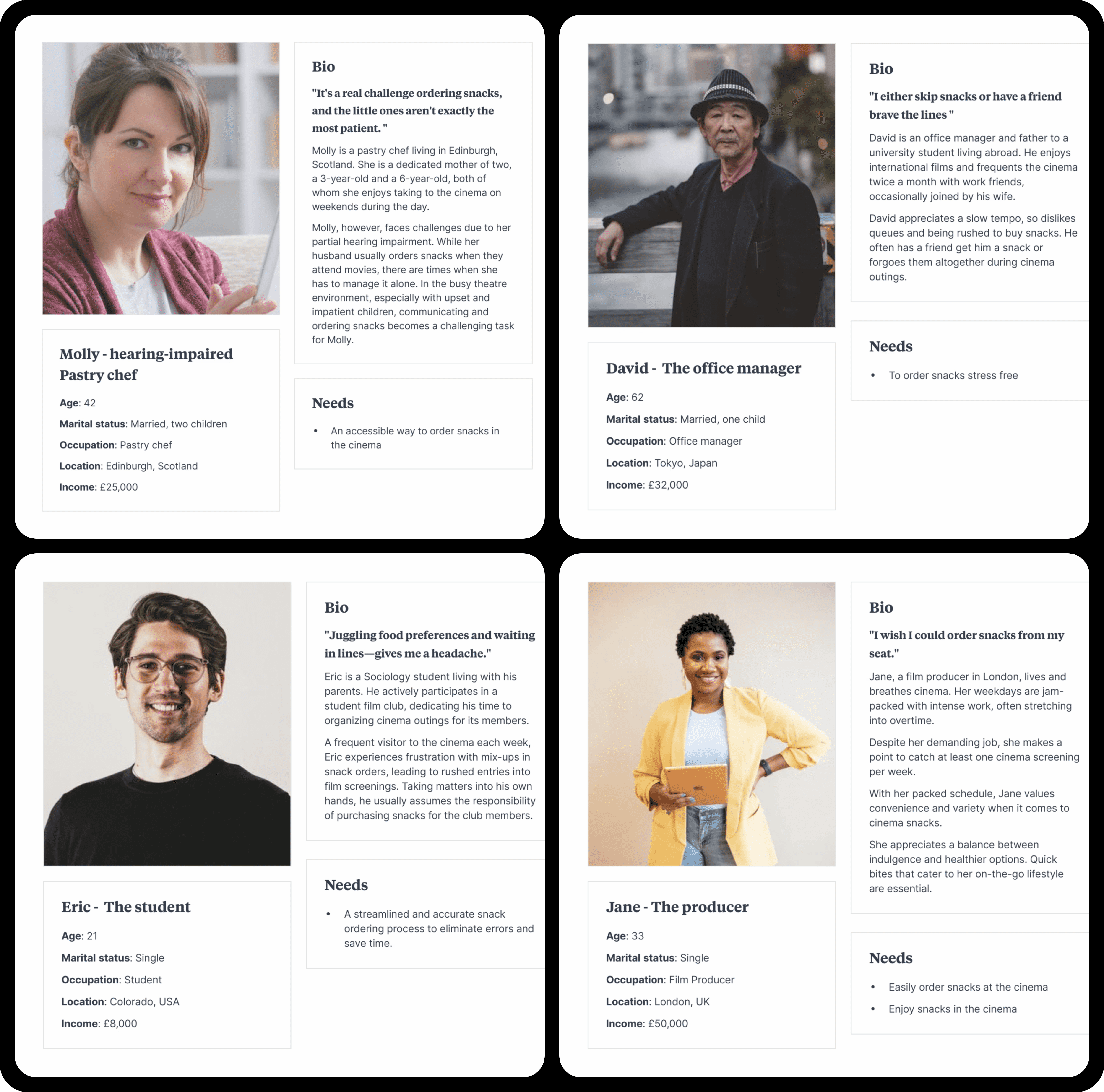
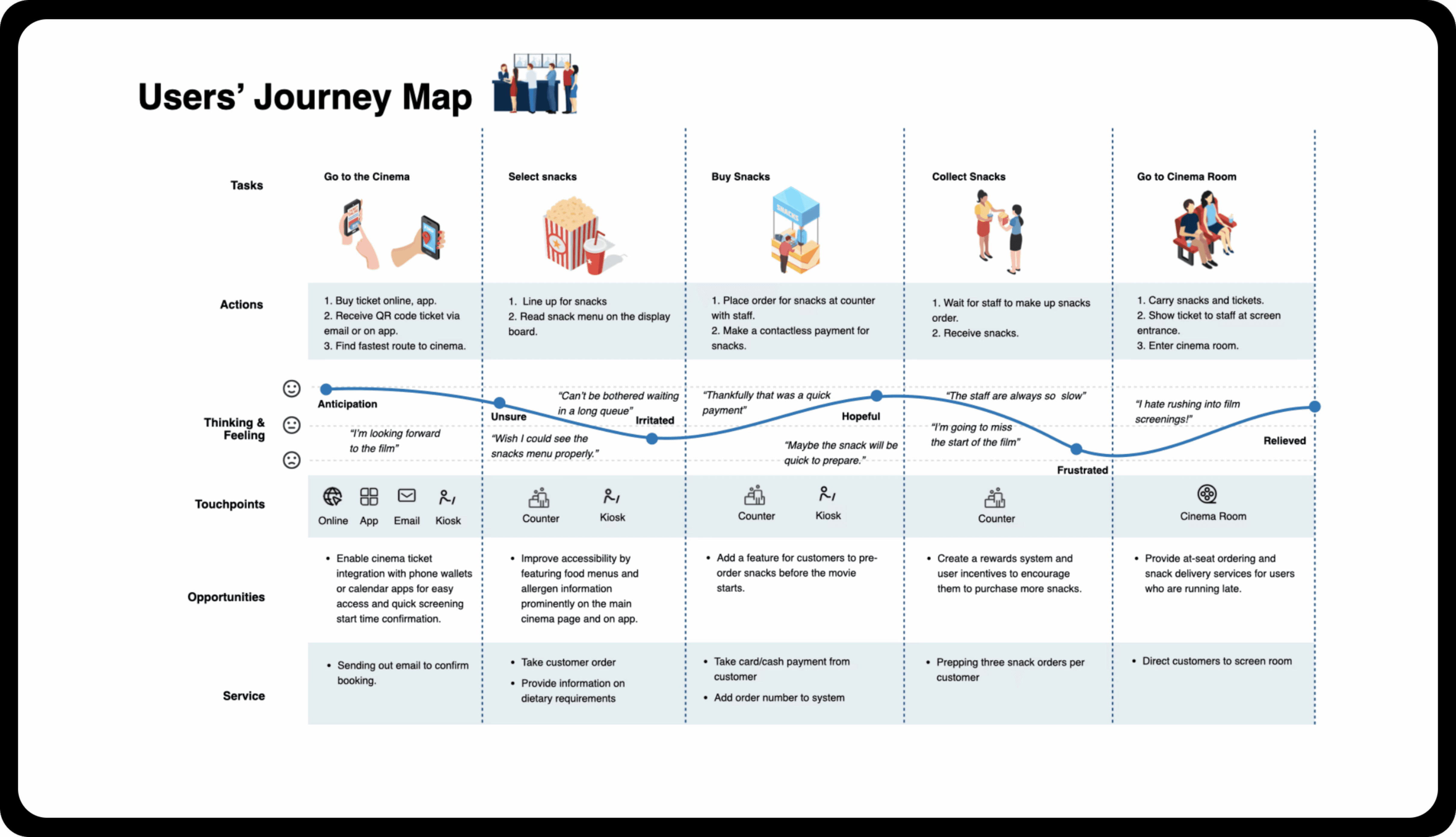
The research confirmed that long wait time in lines frustrated users and also highlighted a need for better accessibility in the ordering process. I adjusted the design to make the app easier to use and more accessible, featuring a cleaner interface for quicker decision-making.
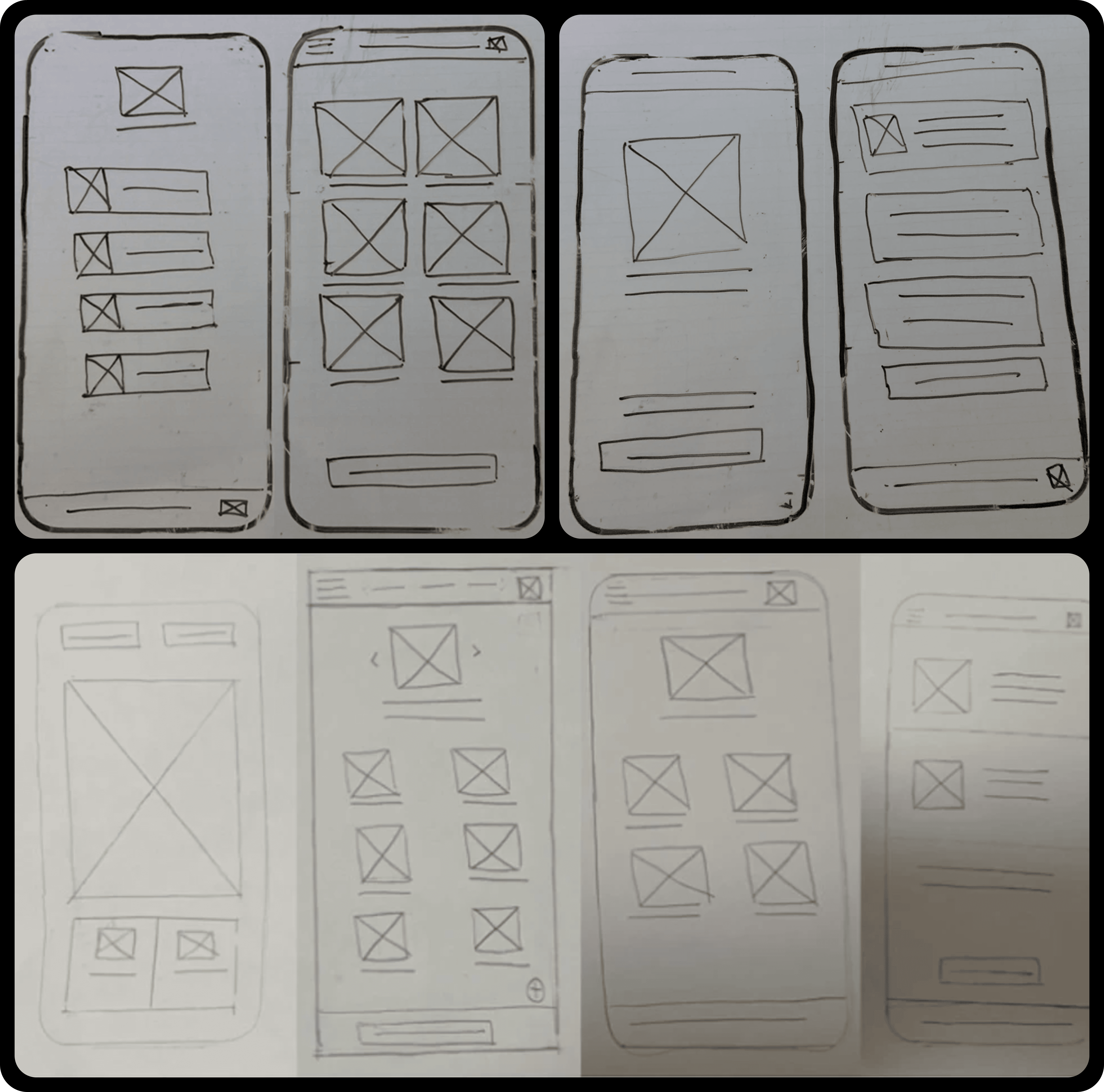
Paper Wireframes
I decided to create simple interfaces with clearer calls to action. I aimed to make it easy for users to complete their pickup orders by using large images and straightforward navigation.
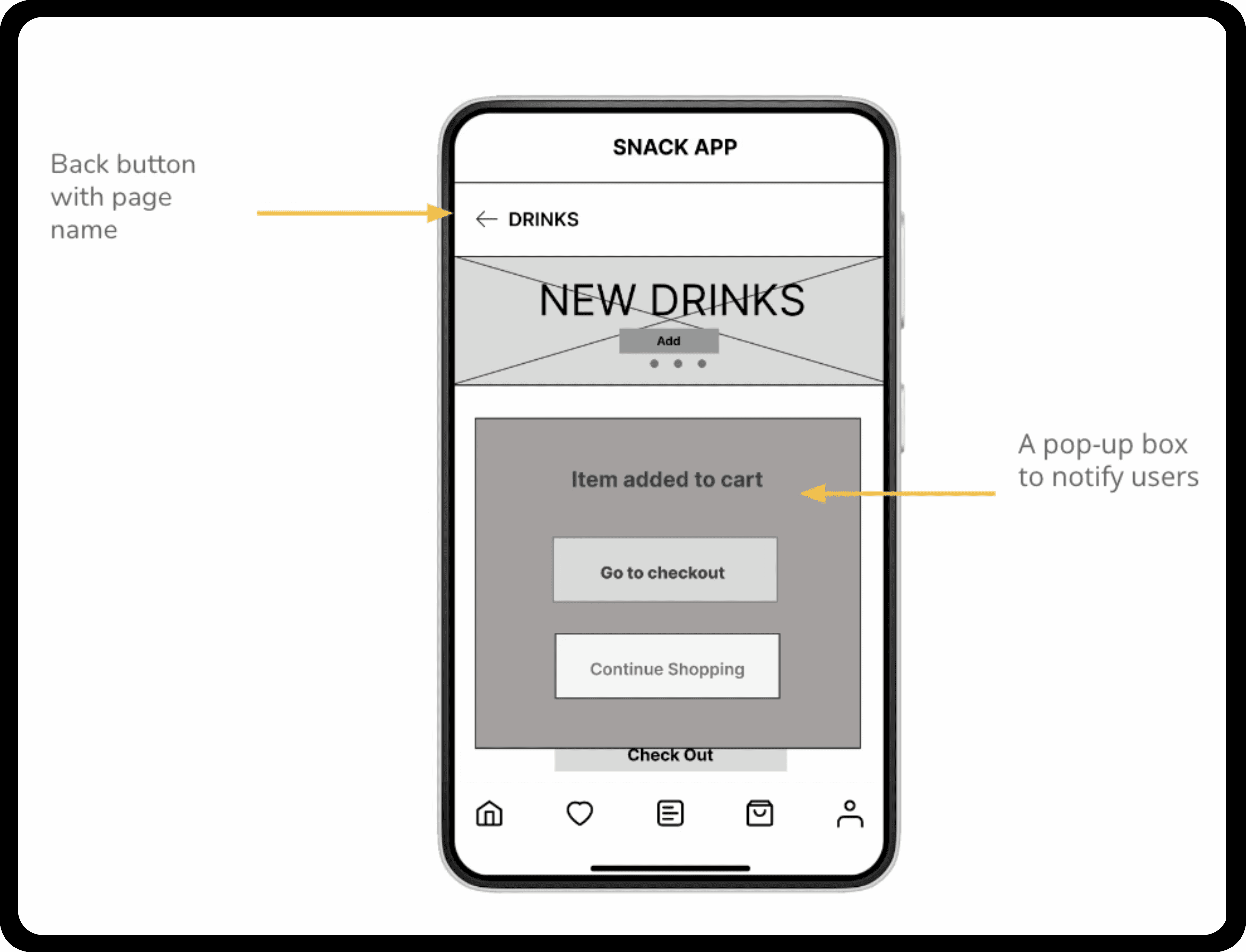
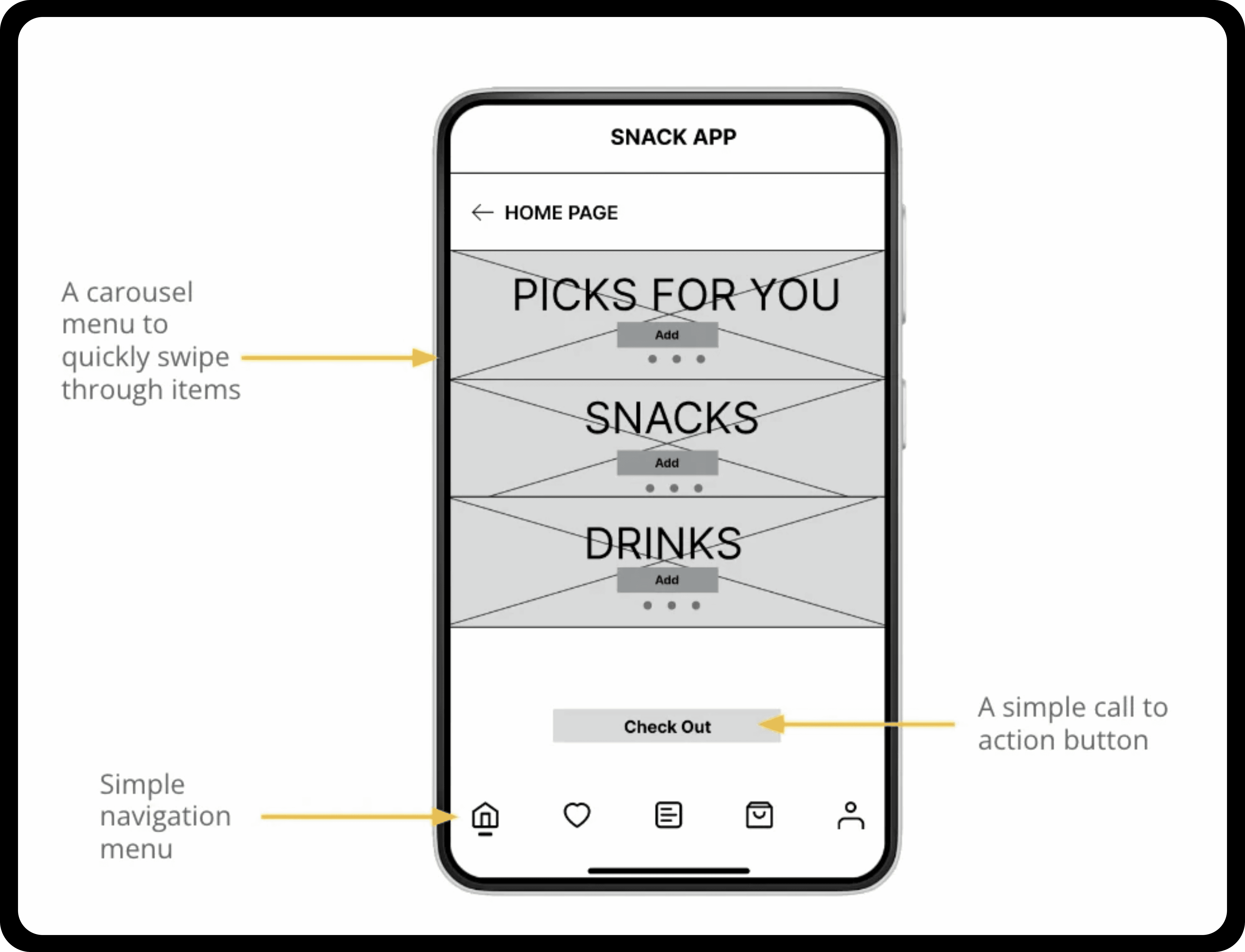
Digital Wireframes
I aimed to create an app with clear titles, and call to actions for home page. I focused on keeping products featured on the home page screen to be visually represented using photos for clarity. Because the purpose of the app is to shop and buy products, I added more available options directly on the home page. This is essential for enabling users to make their selections quickly without navigating between pages and potentially causing misdirection. Signposting and providing back buttons to help go back a step at any stage.
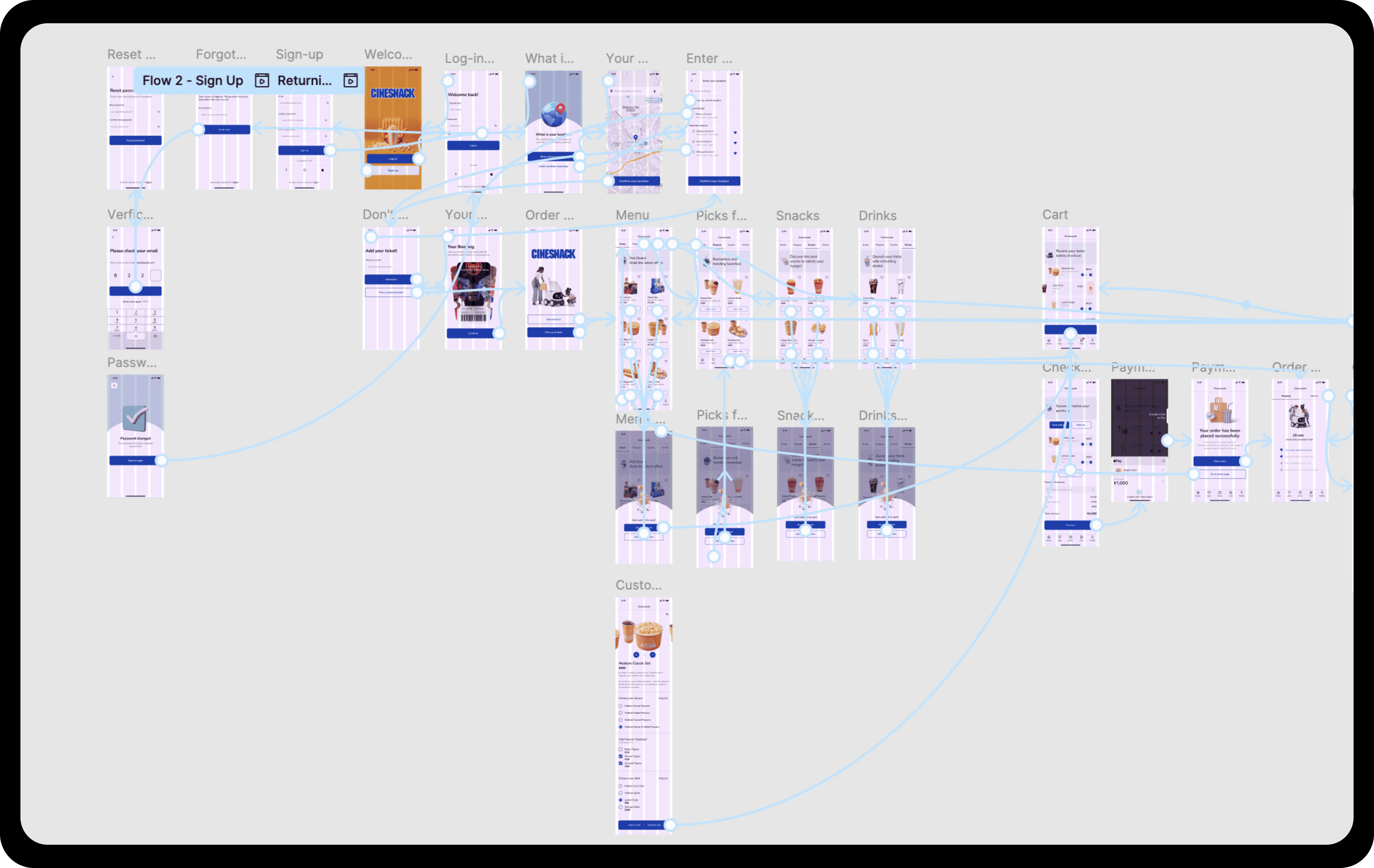
Prototype
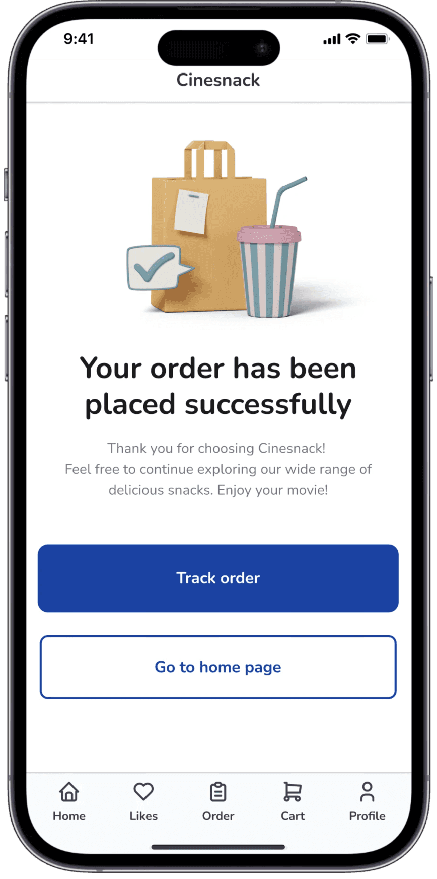
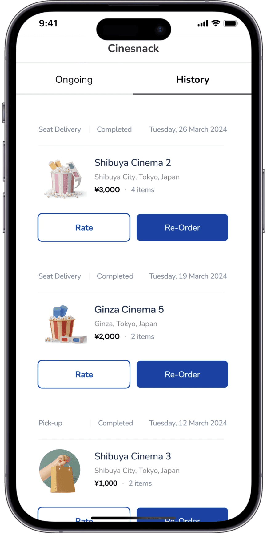
A standard user flow allowing users to browse snacks, add items to the cart, complete the checkout process, and track orders within the app.
Usability study
I conducted a usability study to determine if the main user experience, ordering a snack, is usable for potential customers to complete. I wanted to understand is there were specific challenges that users might face in the ordering process, the key results showed:
60% of users want a simpler login screen
90% of users want detailed customization for orders
40% of users want the last option to choose between pickup at kiosk or delivery to their seat
Design Iteration
Users wanted detail customization so I provided those extra options to build their food order.
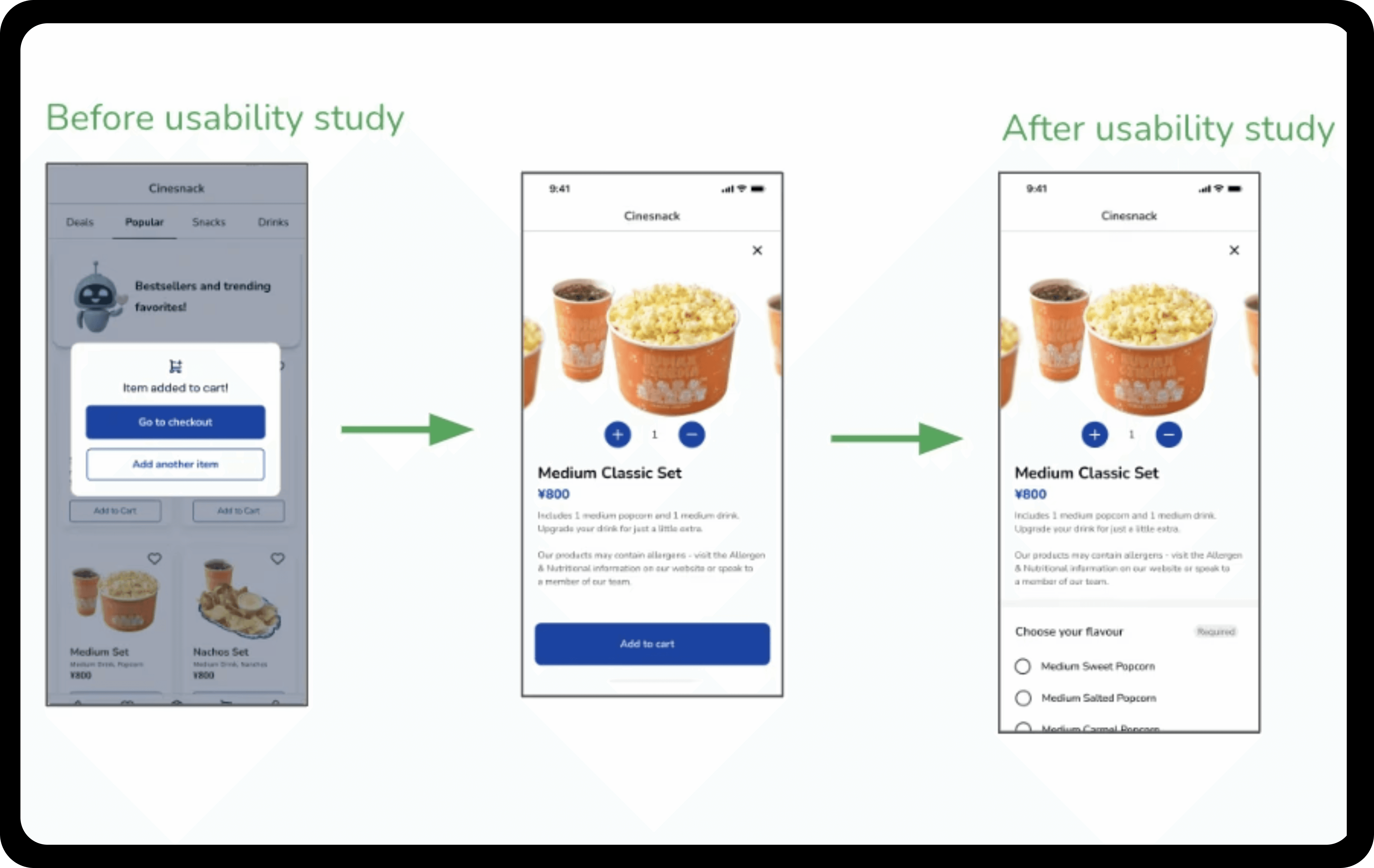
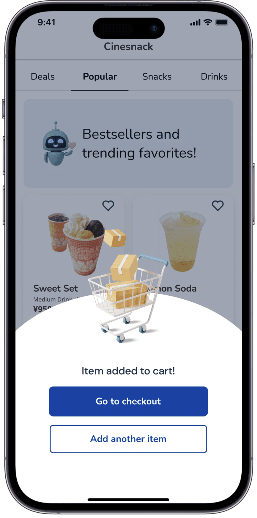
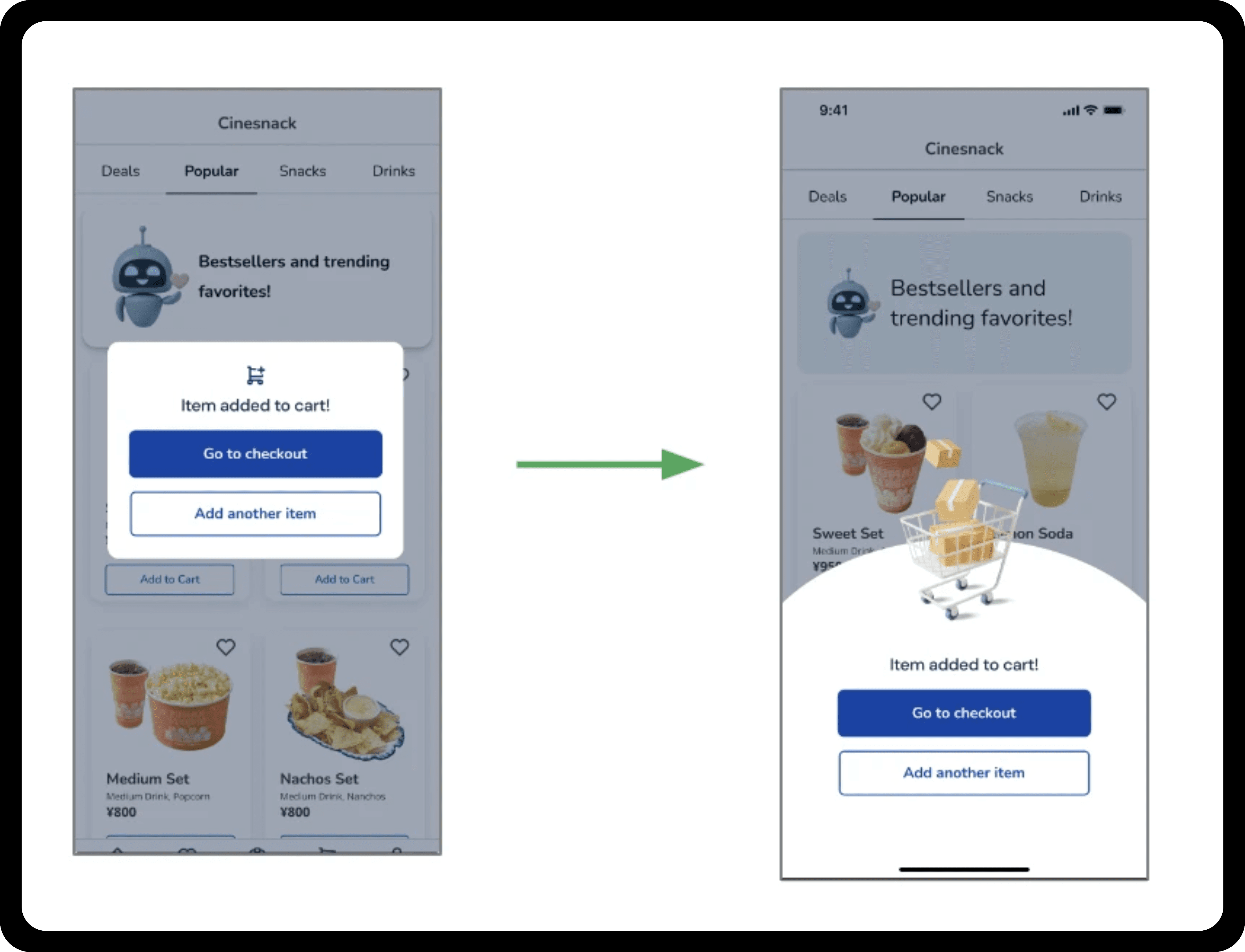
I continued iterating the "Add to cart" pop-up screen. The previous design appeared subtle, plain and not impactful. The placement of call to action buttons needed improvement for purpose of using a smartphone with one hand. The improved iteration made better use of lower half of screen for where the call to actions are placed making it easier to access them with one hand. I introduced a 3D graphic that appears when an item is added to the cart. This graphic element creates depth and impact, enhances the overall screen by providing a more dynamic indication of their actions.
Link to high-fidelity prototype
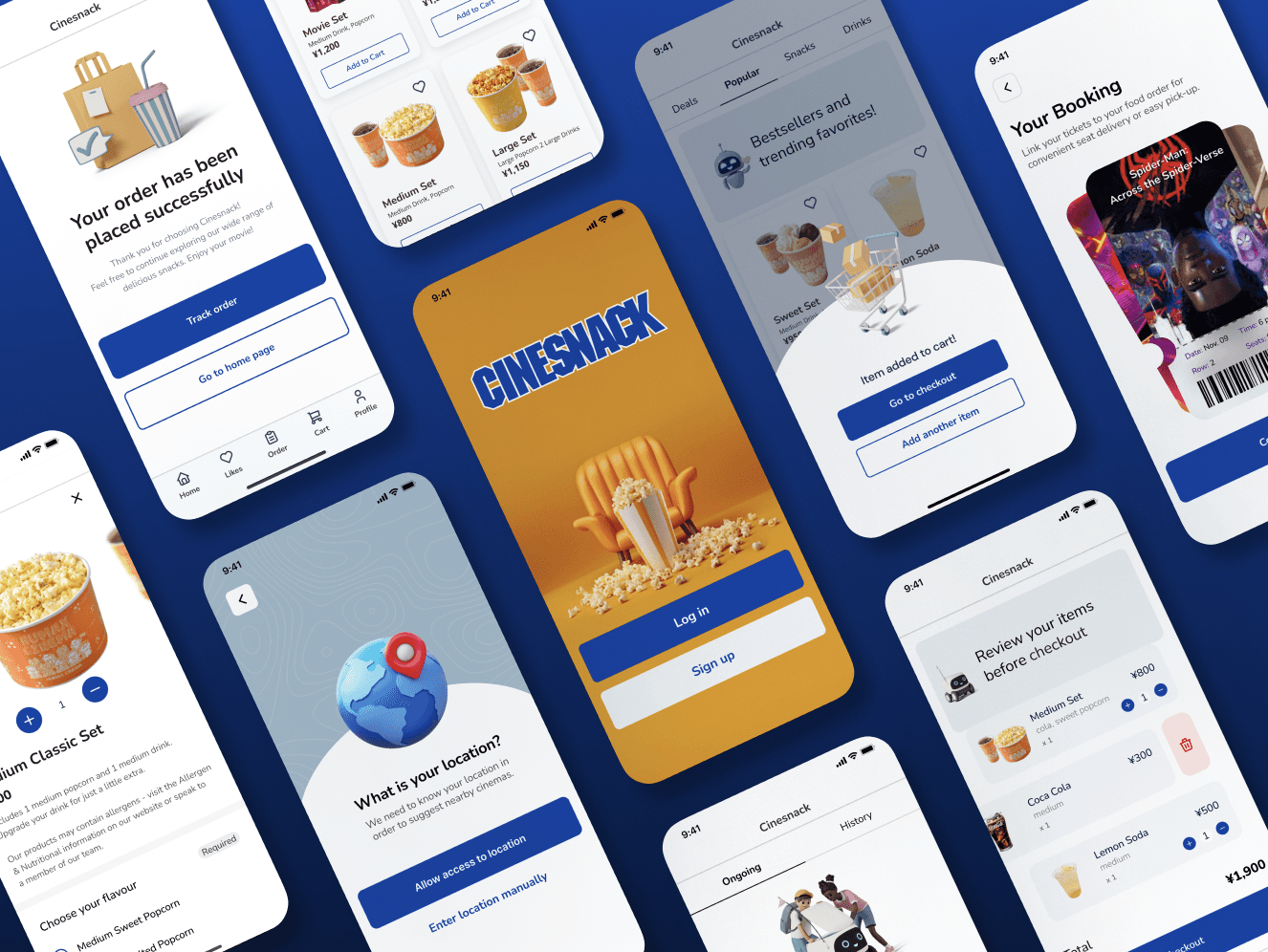
Mock-ups
Results!
The designs for my snack app have been met with enthusiastic feedback.
The focus group who reviewed the final mockup mentioned the following statements:
"It’s easier to find my favorite snacks now. I like the layout."
"This has been a timesaver. I can customize my orders easily."
"Everything’s really straightforward."
"Getting my snacks is way faster now with this app."
What did I learn?
Through this project, I learned a lot about designing an app that's both fun and easy to use. Keeping accessibility in mind made me think about simplifying the design and making everything straightforward and familiar. It was brilliant to see how focusing on these elements can really help make ideas clearer and functions more intuitive for users.